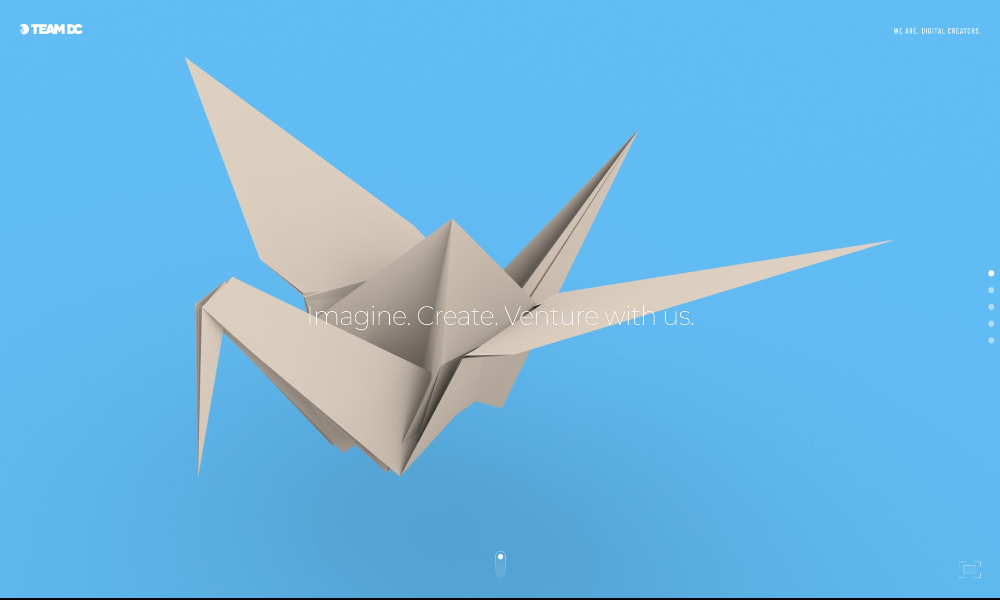
Team DC Brand Refresh
Services rendered
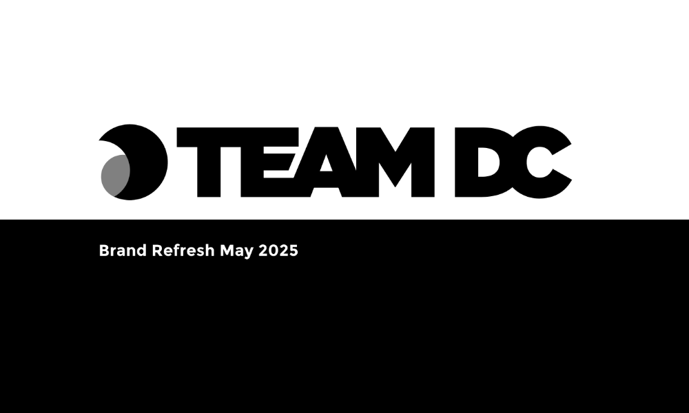
One of my first jobs as Head of Design at Team DC was to re-fresh the brand. We kept the original logo mark and refreshed the logo type, colour scheme, typography, and supporting graphics.
The logo type is based on the Gotham font, with customisations to join the letters, symbolising the team's togetherness.
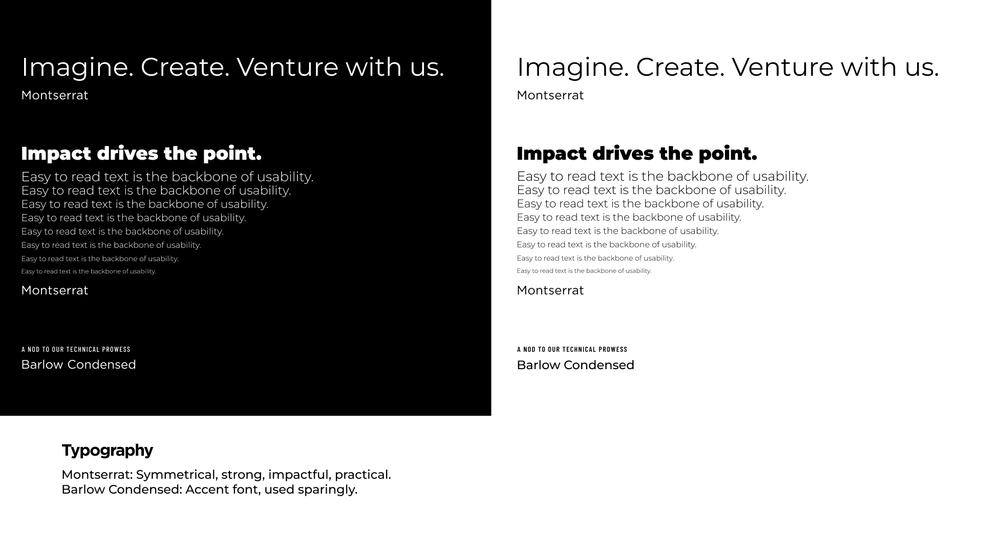
For the typography, I chose Montserrat and Barlow Condensed. These are free-to-use Google fonts that closely resemble Gotham and Din Condensed.
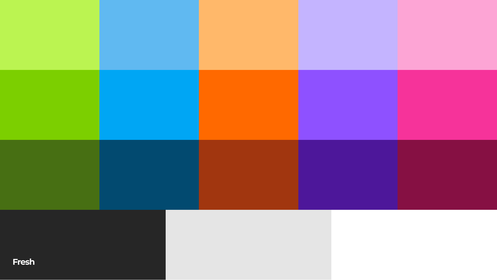
I expanded the colour scheme to be versatile for bright. Showing the many facets of Team DC.
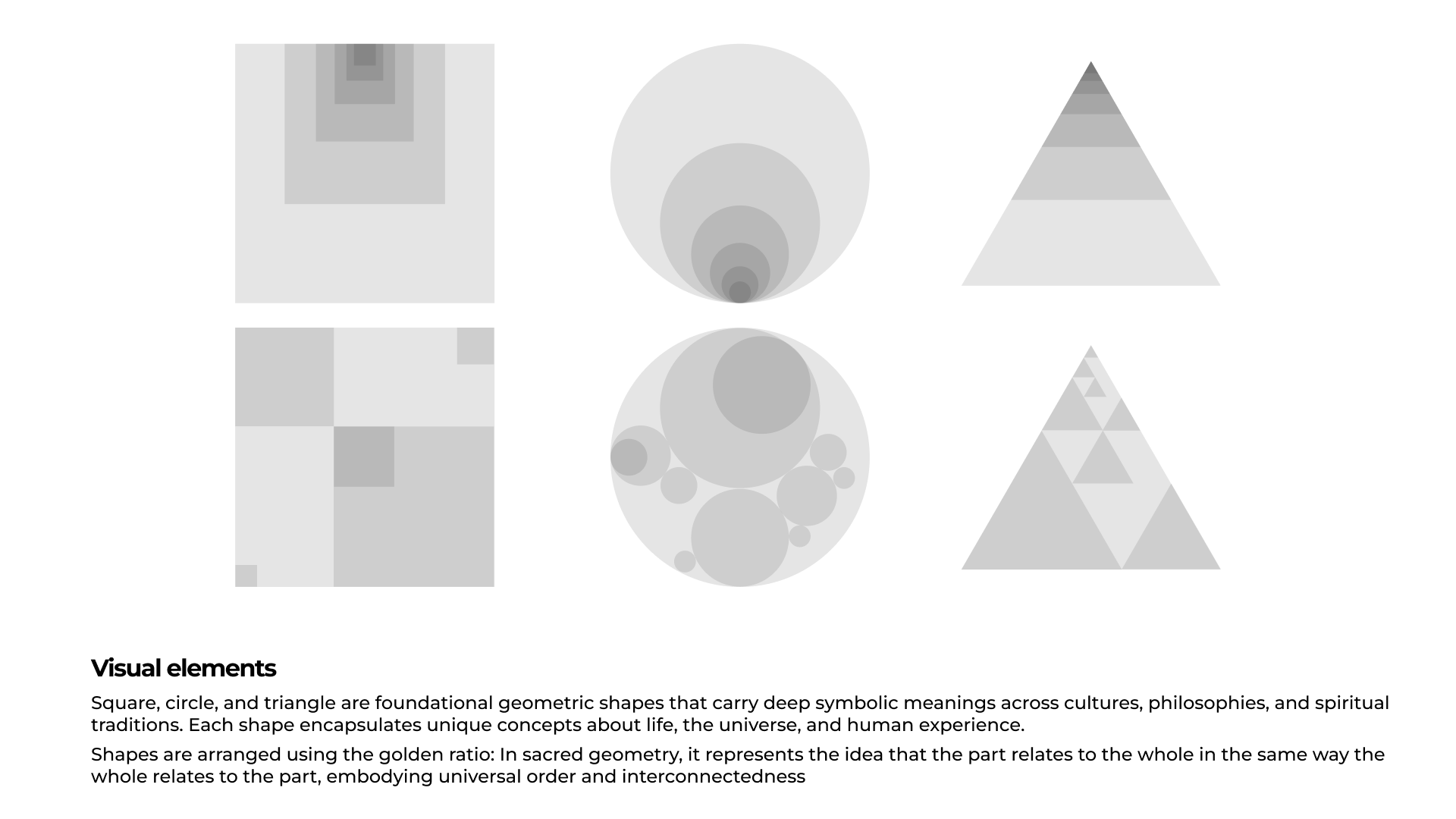
The Visual Elements are a nod to the evolution and history of the Team DC brand. The original logo mark was created using the Golden Ratio. The shapes also follow the same rule when sizing the elements.

No items found.